
Fundraiser Brochure
Overview
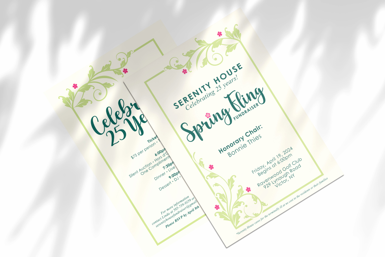
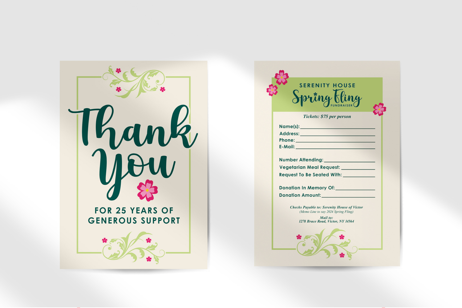
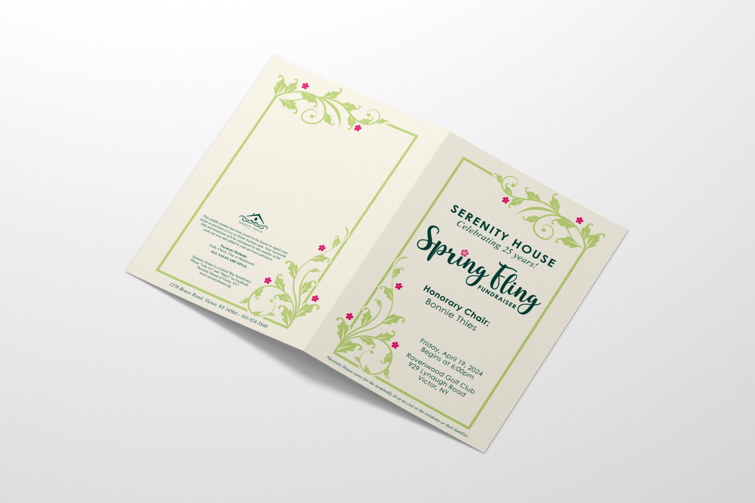
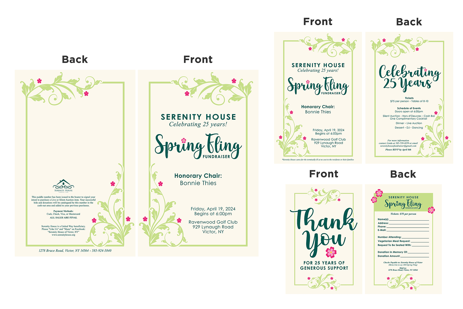
Redesigned a complete event promotion package for Serenity House’s annual Spring Fling Fundraiser, including a brochure, invitation, RSVP ticket, and event signage. The design focused on creating an elegant and welcoming visual identity that reflected the importance of the organization’s mission while providing attendees with clear and engaging event information.
Project Type: Event Promotion & Print Design
Software Used: FlexiSign
My Role
I was responsible for redesigning the event materials, developing the visual direction, creating multiple design concepts, incorporating client feedback, and preparing final artwork for print production. I focused on creating a cohesive design system across multiple printed pieces while balancing aesthetics, readability, and the client’s goals.
Client Story
Serenity House provides 24-hour specialized care for people in their final three months of life. The home is an ideal alternative to hospitals, nursing homes, and in-home care. It’s free of charge. A team of fully trained volunteers and on-call medical professionals staff the home around the clock. The Spring Fling is one of Serenity House's main fundraisers, and all proceeds go towards their cause. The last thing you should think about during one of life's most tragic moments is a price tag.
Project Goals & Results
The goal of this project was to refresh Serenity House’s event materials with a more sophisticated and memorable design that would better represent the organization and encourage community support.
Goals
- Create an elegant and approachable visual identity for the fundraiser
- Improve readability and information hierarchy across printed materials
- Develop a cohesive design system across brochures, invitations, tickets, and signage
- Incorporate the client’s requested floral elements and color direction
- Prepare print-ready artwork for event production
Results
- Created a complete event promotion package with consistent branding across multiple materials
- Developed a refined visual style using typography, color, and floral elements to enhance the event experience
- Improved the clarity and professionalism of the original design while maintaining the organization’s welcoming tone
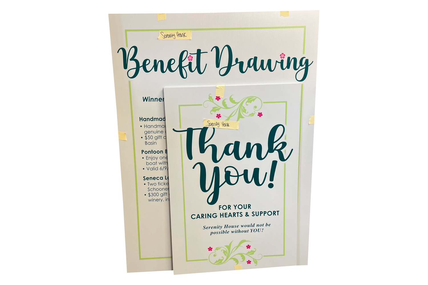
- Produced additional event signage to support the fundraiser beyond the initial print materials
Process
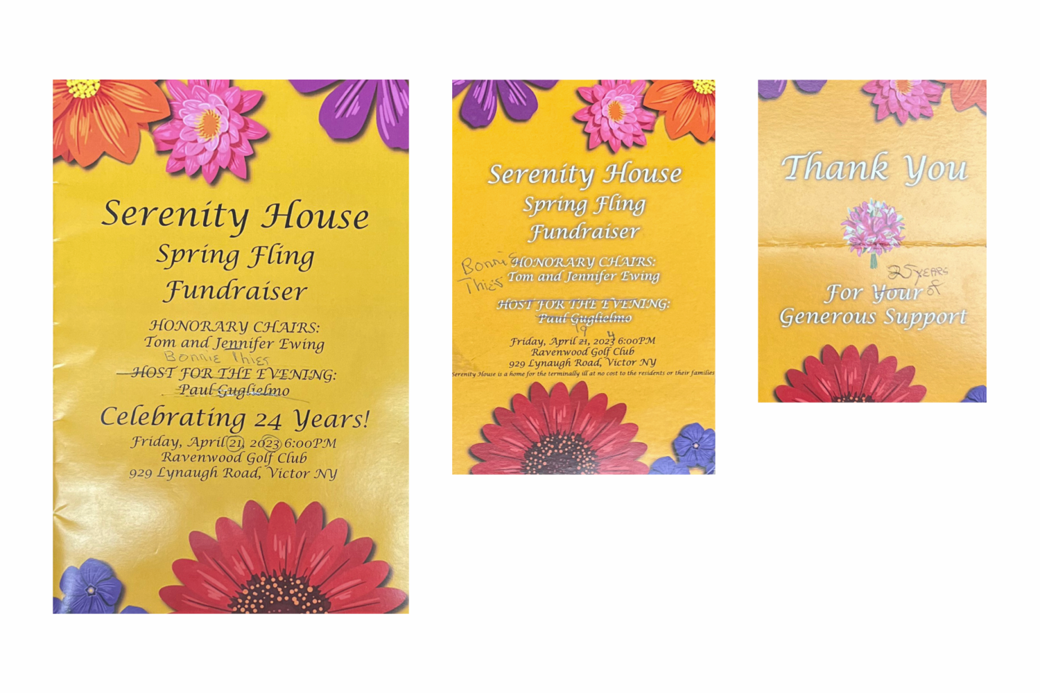
Client Consultation
The project began by reviewing Serenity House’s goals for the Spring Fling Fundraiser and understanding the desired tone: elegant, simple, and welcoming. I used the organization’s mission and event purpose to guide the overall visual direction.
Initial Design Concepts
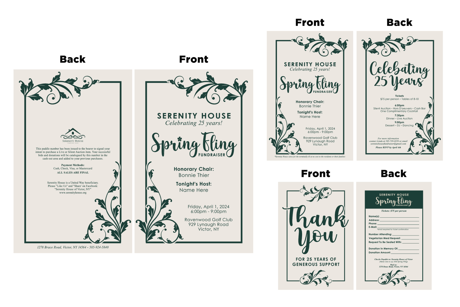
I evaluated the original materials and identified opportunities to improve hierarchy, readability, and visual appeal. I explored different layouts, color options, and floral treatments to create a more polished and cohesive design.
Client Feedback & Iteration
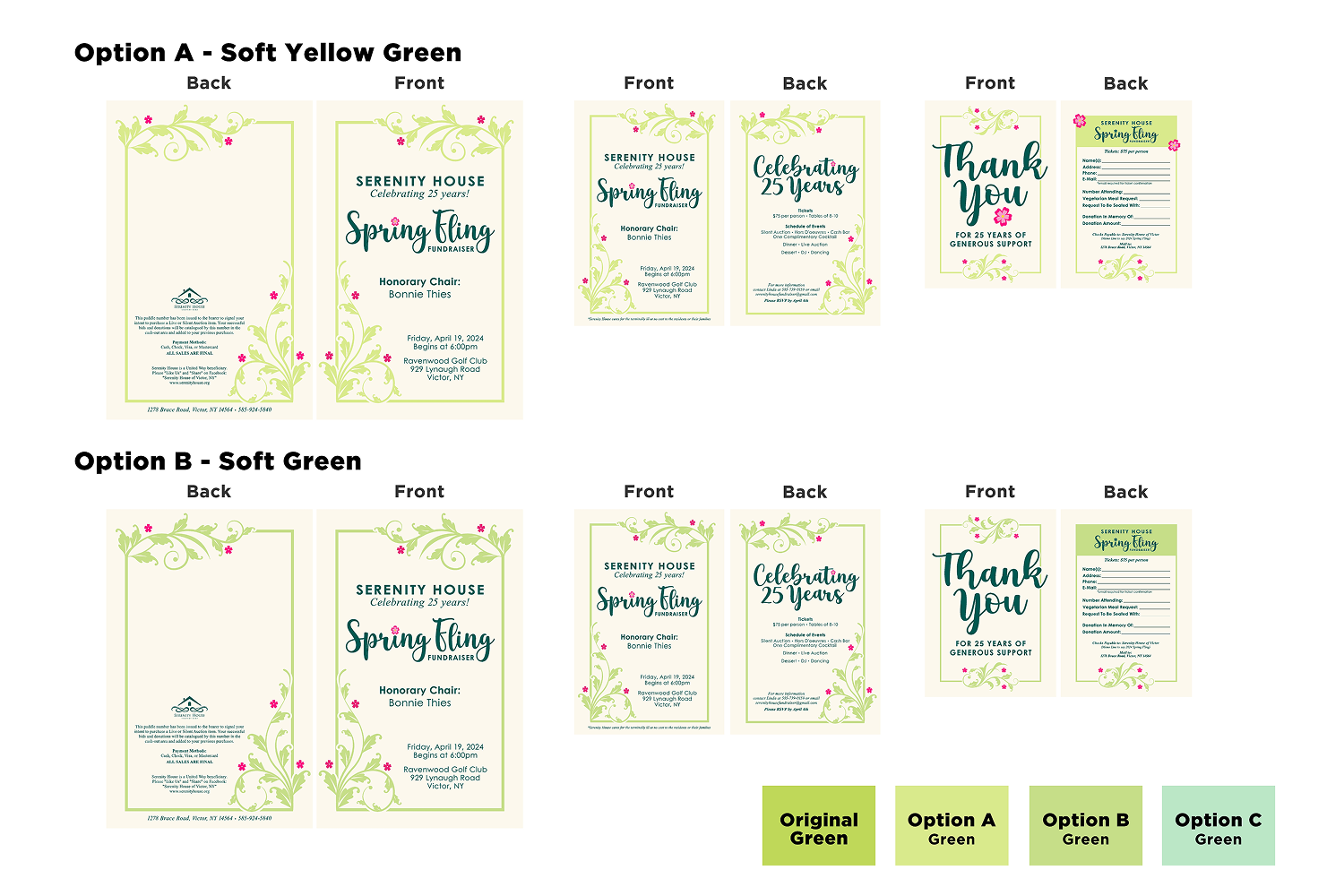
After presenting initial concepts, I worked with the client to refine the design direction. When the client had difficulty choosing a specific shade of green, I created multiple curated color variations to make the decision process easier and more efficient.
Final Design Refinement
Based on client feedback, I simplified the floral elements, refined typography, and improved the overall layout structure. The final design created a balance between sophistication and warmth while clearly communicating event details.
Print Preparation & Production
I prepared the final artwork for production and created additional event signage to support the fundraiser. I ensured the files were properly formatted and ready for printing while maintaining consistency across all event materials.

Takeaways
This project taught me a lot about working with clients, especially when it comes to decision-making. The client had a really hard time choosing a color scheme, so I narrowed it down and gave her three solid options to pick from. That approach helped simplify the process and made it easier for her to make a final decision. It reminded me how important it is to guide clients in a way that keeps things moving while still giving them a sense of control.
Successes
I’m really proud of how the new brochure design turned out. Compared to what the client had before, this version feels like a huge upgrade. Since it’s for a formal auction fundraiser, I wanted to make sure the design felt polished and elegant, and I think I hit that mark. It also feels more modern and much easier to read—everything is cleaner, better organized, and more visually appealing.
Changes
Overall, I think this project went really smoothly. If I were to go back and change anything, I might experiment with adding more floral elements or making the existing ones larger. That could help the layout feel a little more dynamic and less minimal in spots.
Contact
I’m always excited to connect and discuss new opportunities, projects, or collaborations. Whether you have a question, a project idea, or want to work together, feel free to reach out!