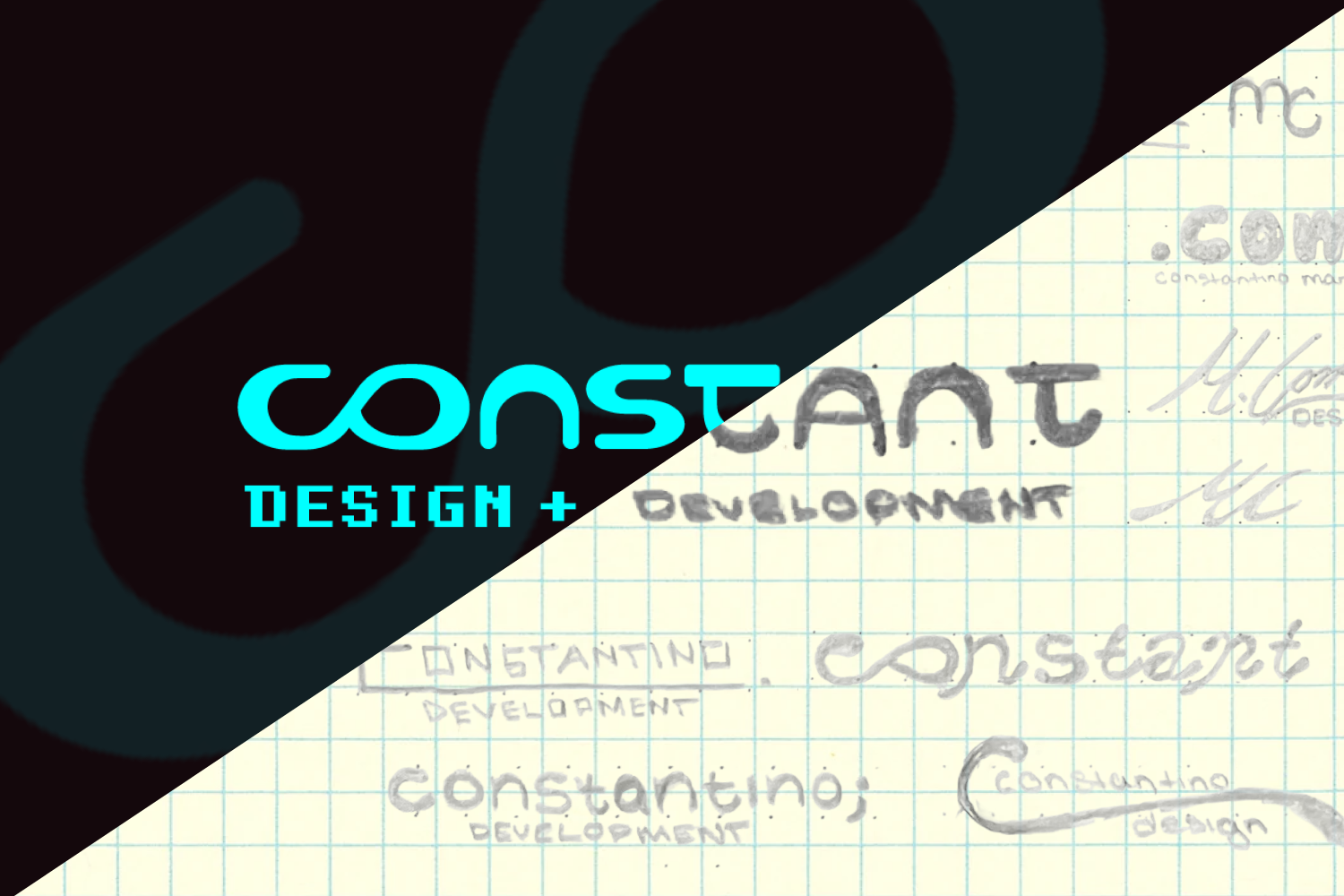
Constant Design Logo
Overview
Created a professional visual identity for Constant Design & Development through an iterative logo design process. The goal was to develop a memorable and scalable brand mark that represented the connection between creativity, technology, and continuous growth while maintaining flexibility across digital and print applications.
Project Type: Logo Design & Brand Identity
Software Used: Adobe Illustrator
My Role
I was responsible for developing the complete logo concept, including research, brainstorming, sketching, digital refinement, color exploration, and final asset preparation. I focused on creating a versatile identity system that could represent both my design and development skills while remaining recognizable across different applications.
Project Goals & Results
The goal of this project was to create a personal brand identity that communicated my approach to design and development while following professional logo design principles.
Goals
- Create a logo that represents my personal values and creative approach
- Develop a mark that was simple, memorable, and scalable
- Incorporate elements related to both design and technology
- Create a flexible identity that could be used across digital and print materials
- Ensure the logo maintained clarity in different sizes and color variations
Results
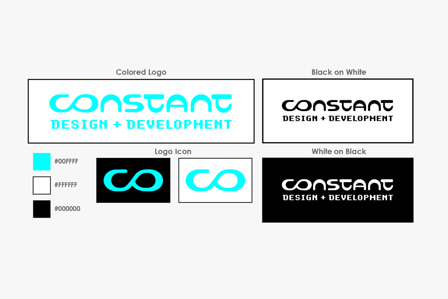
- Created a complete logo system with color, black, and white variations
- Developed a recognizable symbol that works independently at smaller sizes
- Created a brand identity that represents creativity, problem-solving, and continuous improvement
- Produced final assets suitable for professional and digital applications
Process
Brainstorming & Brand Exploration
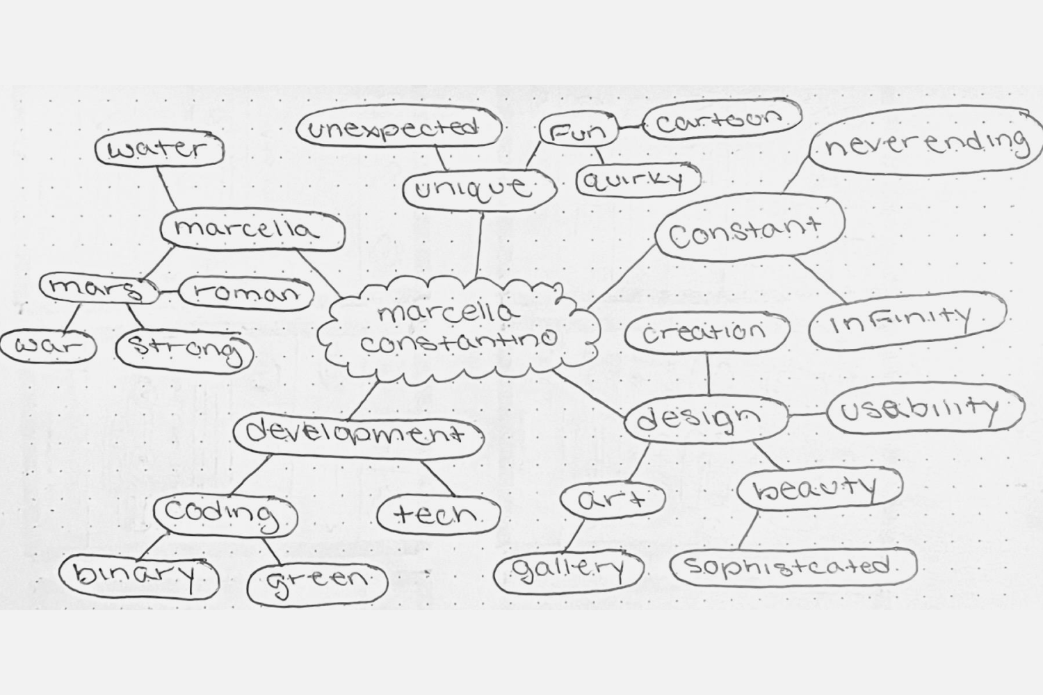
I began by creating a mind map to explore words, concepts, and personal qualities that represented my identity as a designer and developer. Themes such as creativity, technology, growth, and innovation helped establish the foundation for the logo direction.
Sketching & Concept Development
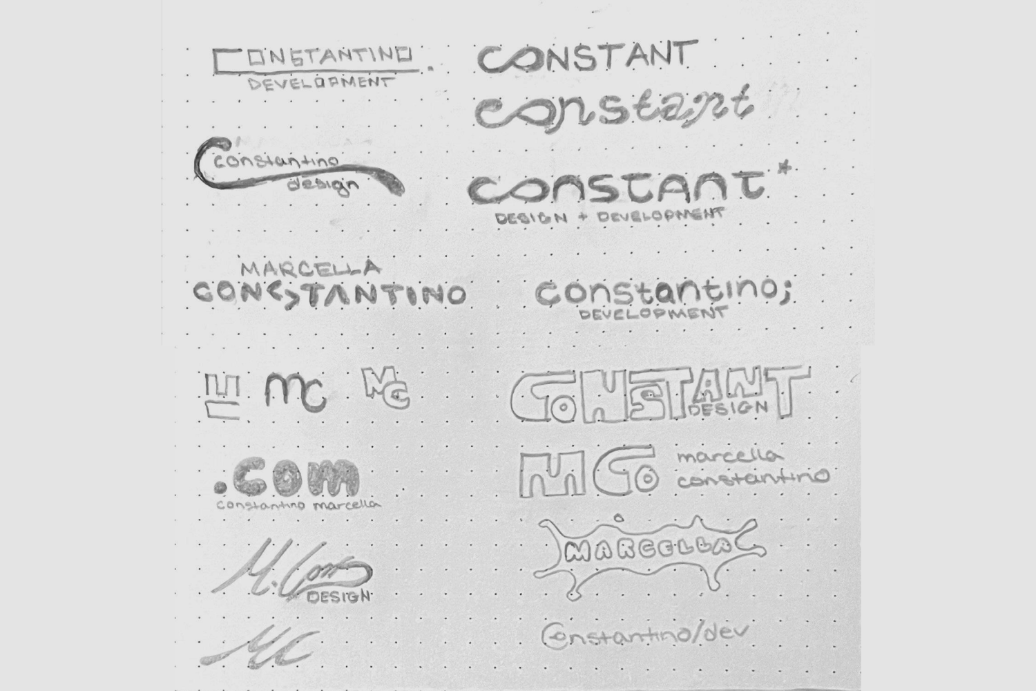
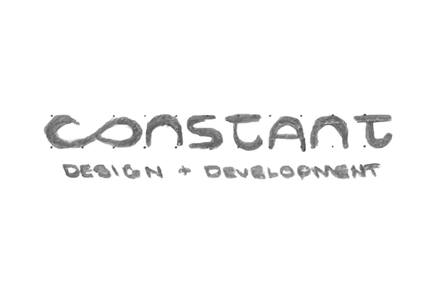
Using these themes as inspiration, I created multiple logo concepts exploring typography, symbols, and visual connections between design and development. I focused on creating a mark that felt modern while still reflecting my personal style.
Final Concept Selection
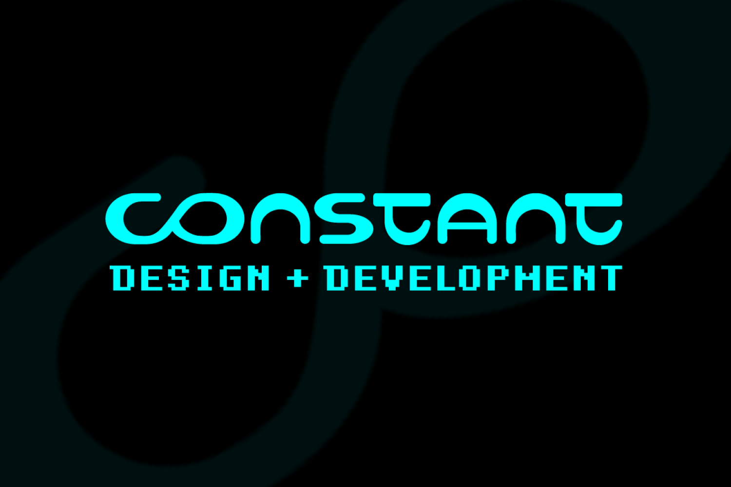
I selected the final concept based on its ability to communicate continuous growth and creativity. The hidden infinity symbol created by the “C” and “O” became a key element of the design, representing ongoing learning, problem-solving, and the evolving nature of design and technology.
Digital Refinement
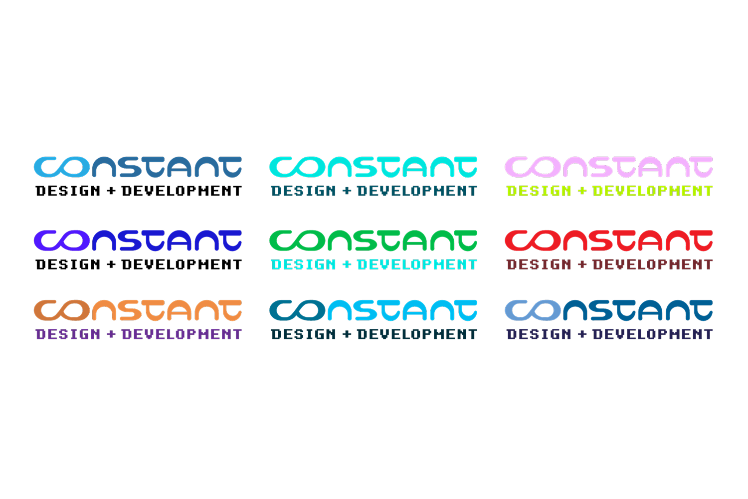
After selecting the final sketch, I recreated the logo digitally and explored different color combinations. I chose a bright green accent because it created a strong visual impact while reinforcing the technology and digital aspects of the brand.
Final Logo System
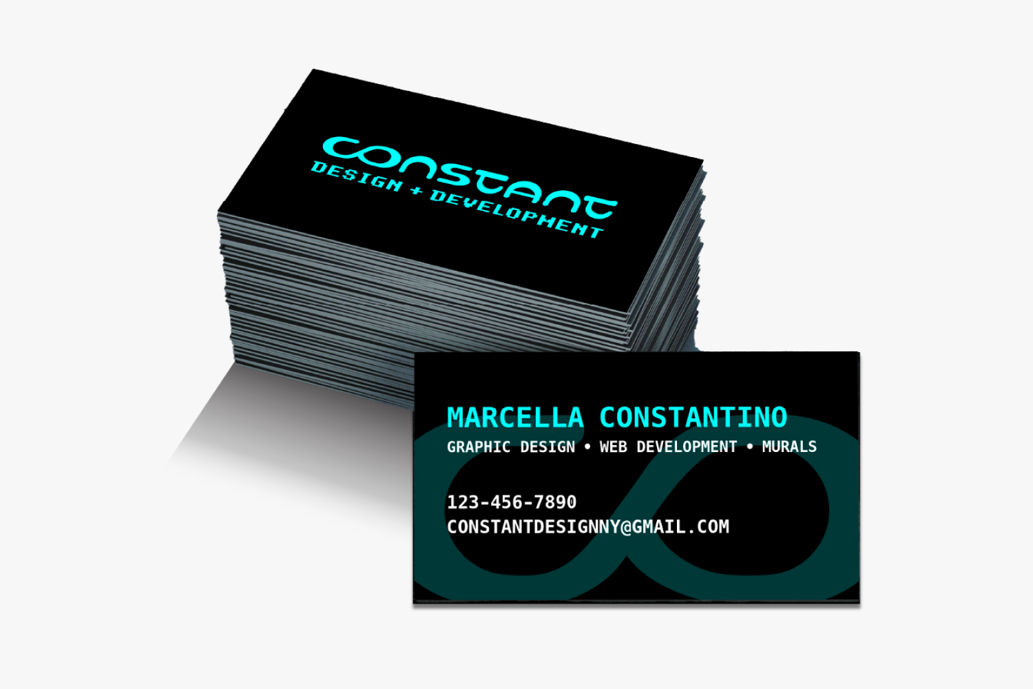
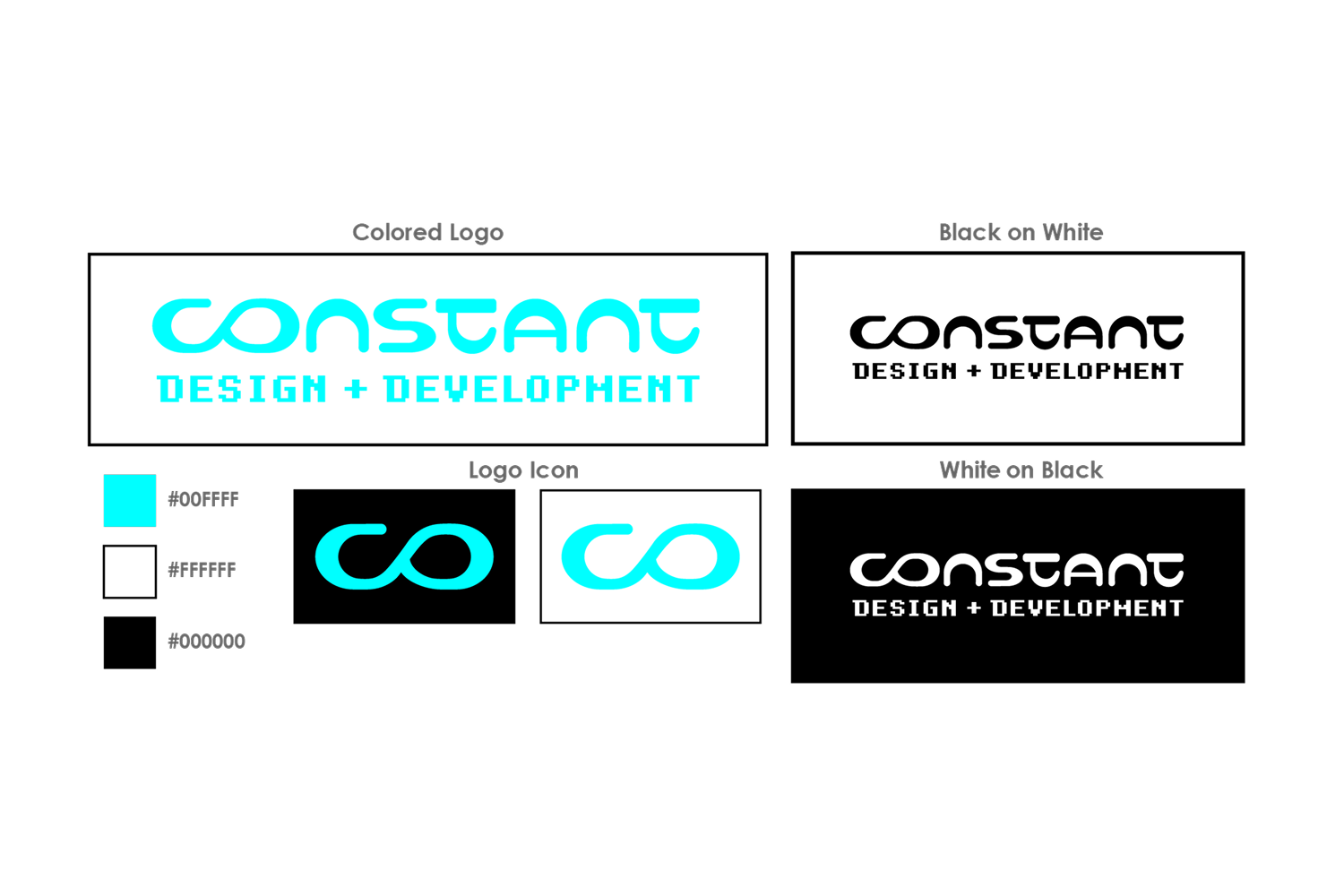
The final identity was developed in multiple formats, including color, black, and white variations. The standalone icon allows the logo to remain recognizable when used at smaller sizes, ensuring flexibility across websites, social media, business cards, and other brand applications.

Takeaways
One of the most important lessons I learned while designing this logo was the value of early iteration in the design process. Spending time sketching, brainstorming, and experimenting with ideas allowed me to explore multiple directions before committing to a final design. This project also reinforced the importance of scalability in logo design, ensuring that the logo remains clear, recognizable, and effective at any size.
Successes
The biggest success of this design is its scalability and visual appeal. The use of an infinity icon strengthens the logo’s adaptability while maintaining strong visual interest. The final design feels clean, balanced, and versatile, making it suitable for a wide range of applications. I’m proud of how the early exploration led to such a polished final result.
Changes
If I were to revise the design, I might experiment more with the subtext font to see if a different typeface could further enhance the overall look. While I’m very happy with how the logo turned out, refining the typography could add an extra level of polish and cohesion to the design.
Contact
I’m always excited to connect and discuss new opportunities, projects, or collaborations. Whether you have a question, a project idea, or want to work together, feel free to reach out!